Sign In
One message, one action
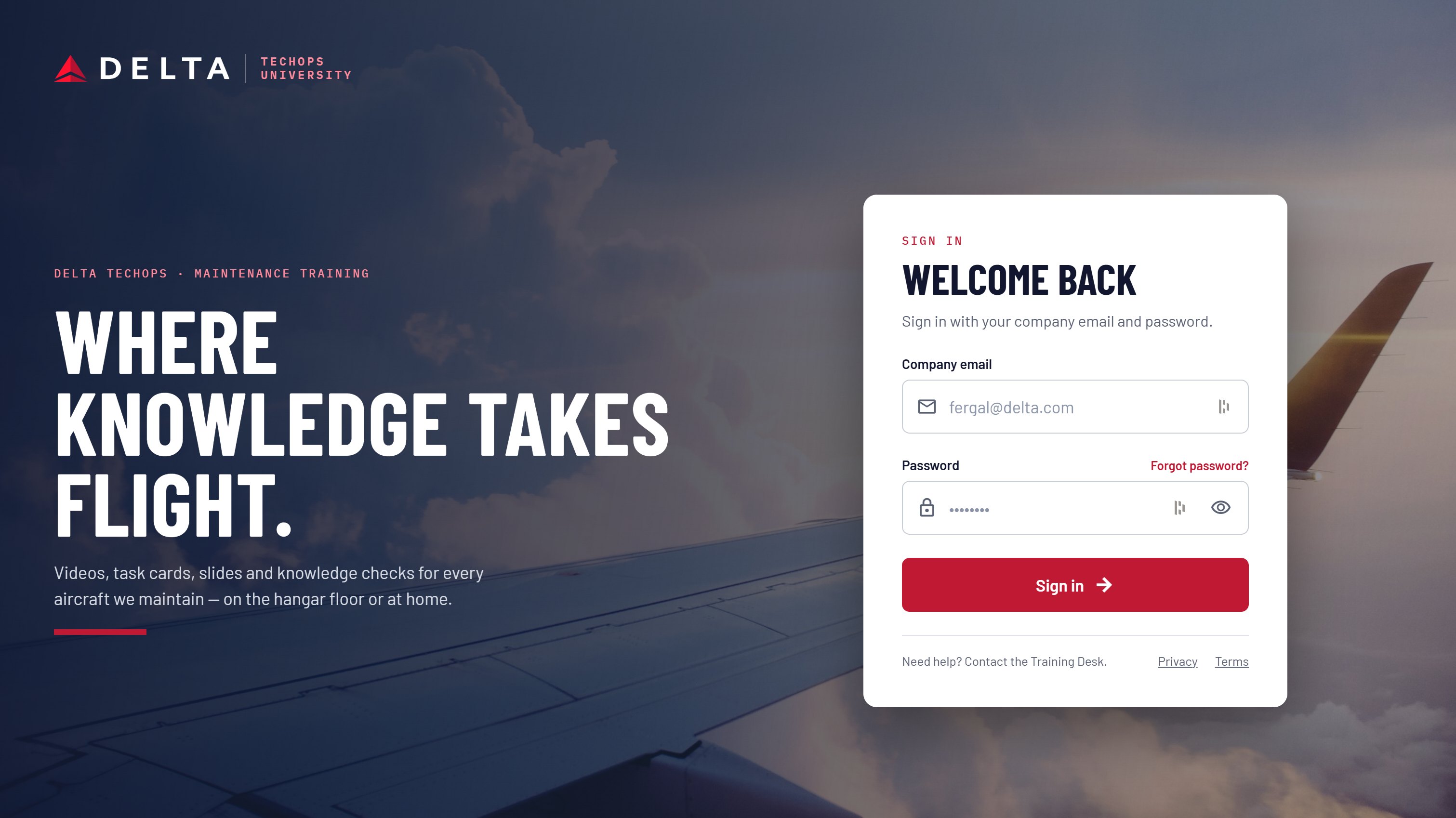
The sign-in screen keeps the programme line, “Where knowledge takes flight”, and a single company-email form. Nothing else competes with getting in.

A training platform for Delta TechOps maintenance technicians: videos, task cards, slides and knowledge checks for every aircraft in the fleet, on the hangar floor or at home.
Training material was spread across formats and organised like a corporate site, with category tiles and news up front. A technician arriving with a required course due had to work to find it.
The people using it are A&P technicians, leads and inspectors. They think in aircraft types, ATA chapters and task cards, and they often fit training in between jobs.
The redesign starts from the technician's question: what do I need to do next? Home opens on the course in progress and what is due, with browsing one step away rather than the first thing on the page.
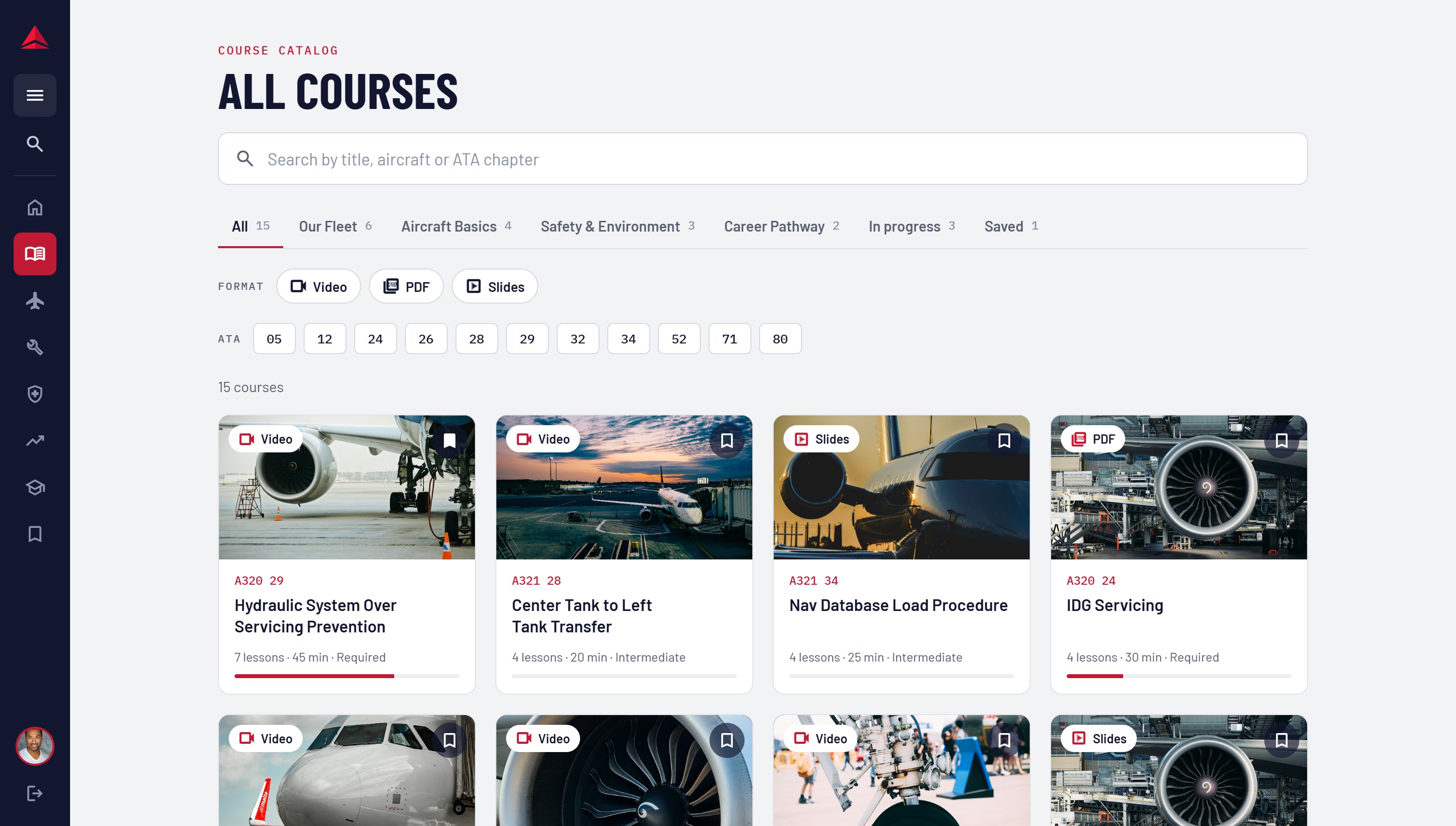
Content is indexed the way maintenance is: by aircraft and ATA chapter, as well as by learning area. A search for “A320 29” goes straight to the right course.
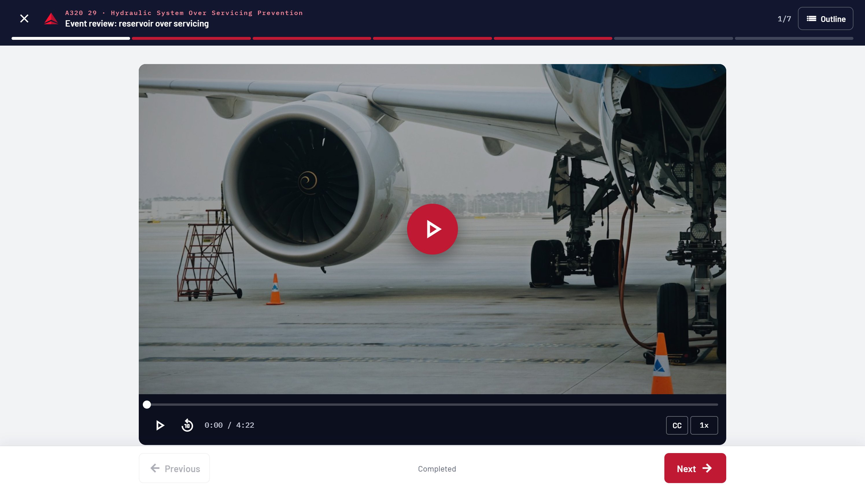
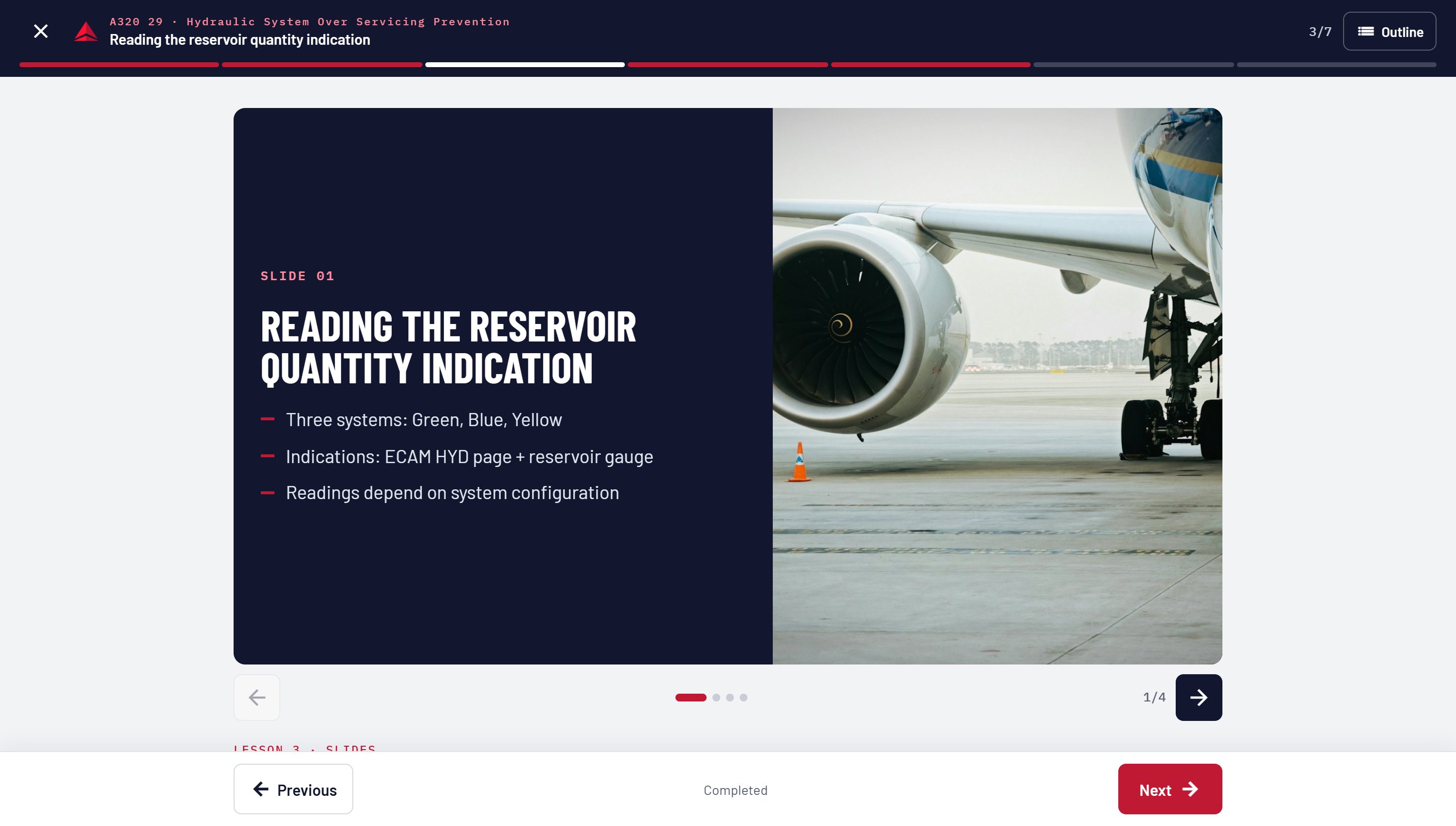
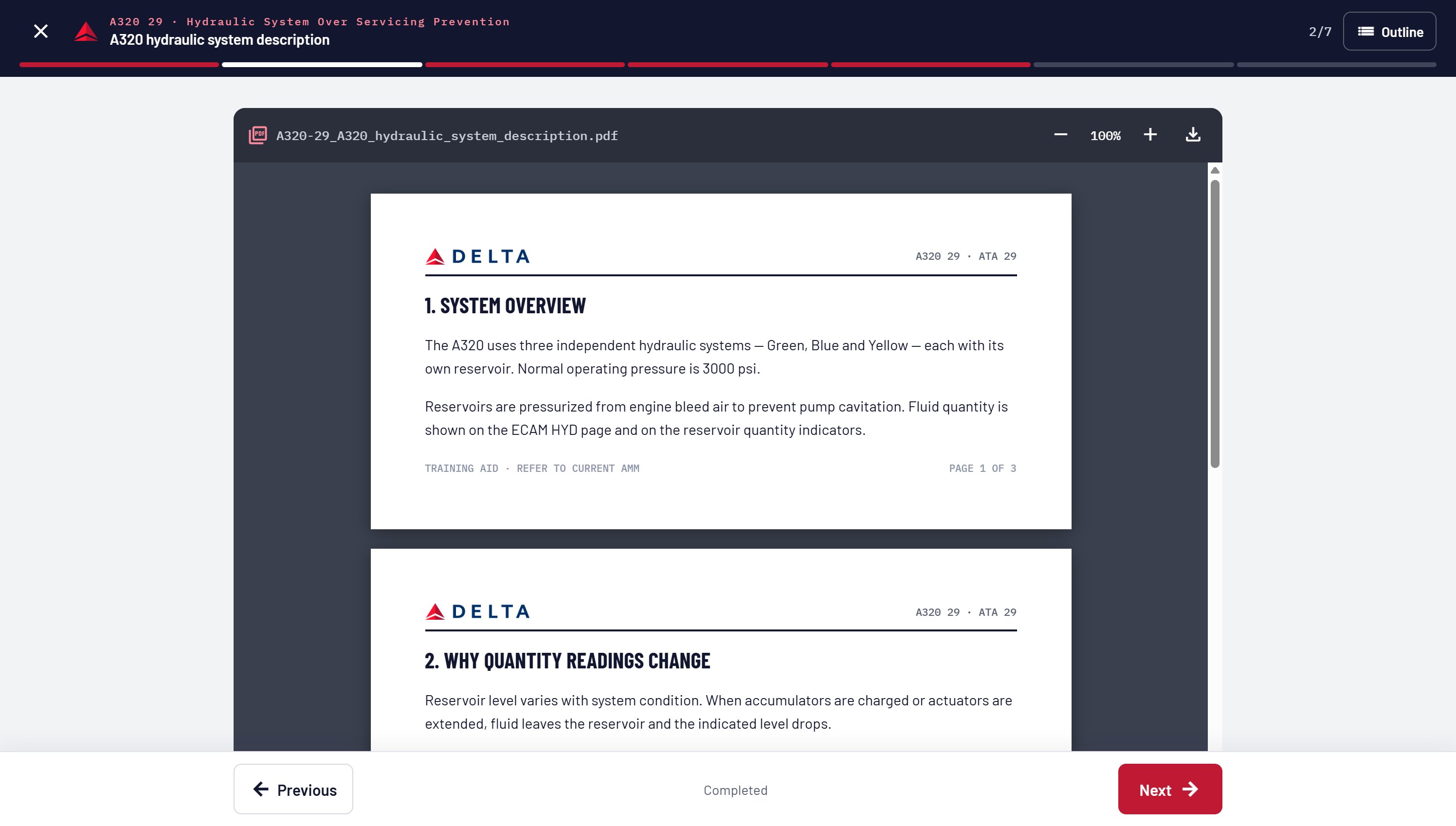
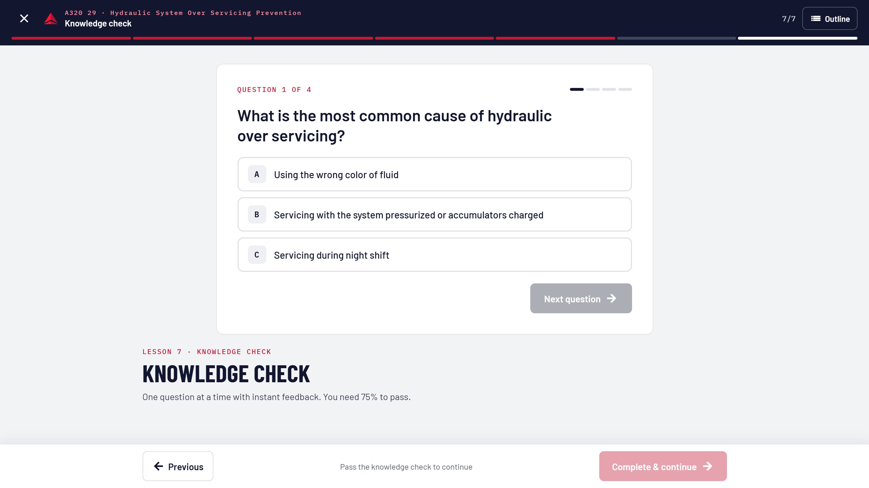
Training material arrives as video, PDF task cards and references, slide decks and knowledge checks. Instead of sending each to a different viewer, every lesson plays inside a single player with the same header, progress bar and Previous / Next controls.
The same structure has to hold on a desktop at home and on a phone in the hangar, so navigation collapses to a slim rail on desktop and a top bar on mobile.
01
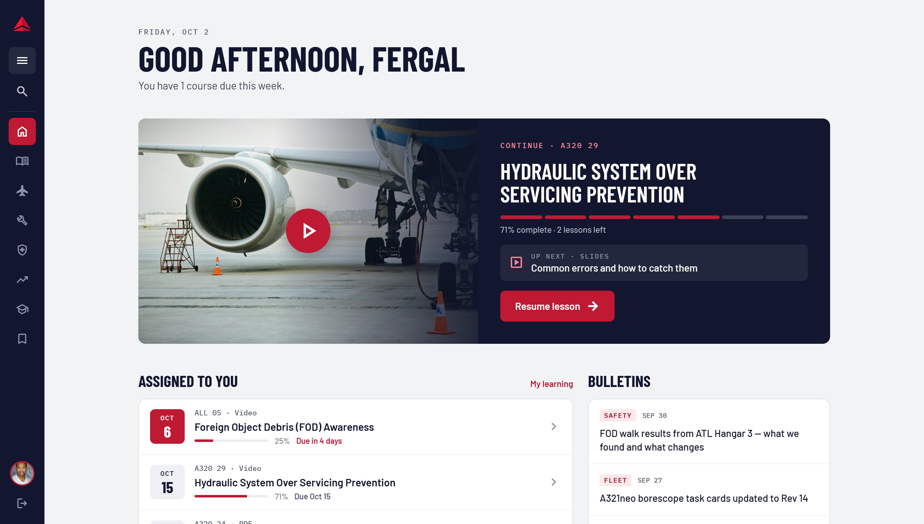
The course in progress and assigned training come first, with due dates shown as dates, not buried in a list.
02
Aircraft codes and ATA chapters sit alongside titles everywhere, and both are searchable and filterable.
03
Video, PDF, slides and quizzes share the same frame and controls, so the format never changes how a lesson works.
Midnight
#12172F
Navy
#284B7C
Delta Red
#C01933
Coral
#FF8A9B
Hangar
#F1F3F6
The flow follows a technician through one course: sign in, pick up where they left off, work through each lesson, pass the knowledge check, and get a record of completion.
Sign In
The sign-in screen keeps the programme line, “Where knowledge takes flight”, and a single company-email form. Nothing else competes with getting in.
Home
Home greets the technician by name, says how much is due this week, and opens on the course in progress with the next lesson named. Assigned courses follow, sorted by due date with progress on each.
Catalog
Search by title, aircraft or ATA chapter. Tabs cover the four learning areas plus in-progress courses, with format and ATA filters underneath.
Course
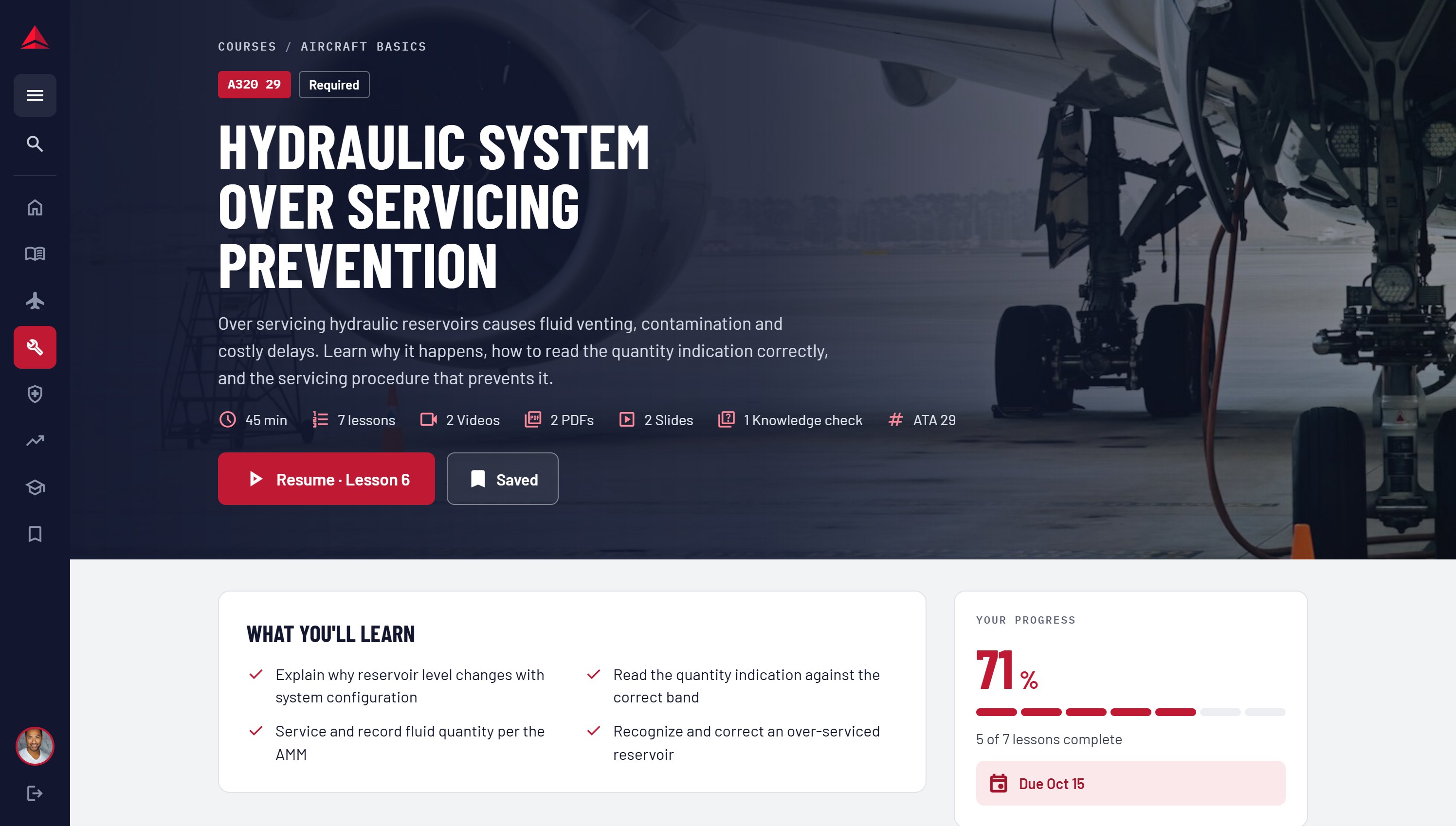
The course page leads with the aircraft and ATA code, whether it is required, and a breakdown of time and lesson formats.
Lesson Player
Video, slides, PDF task cards and knowledge checks all share the same header, segmented progress bar and Previous / Next controls. The knowledge check gates completion, so a course only finishes once it is passed.
Completion
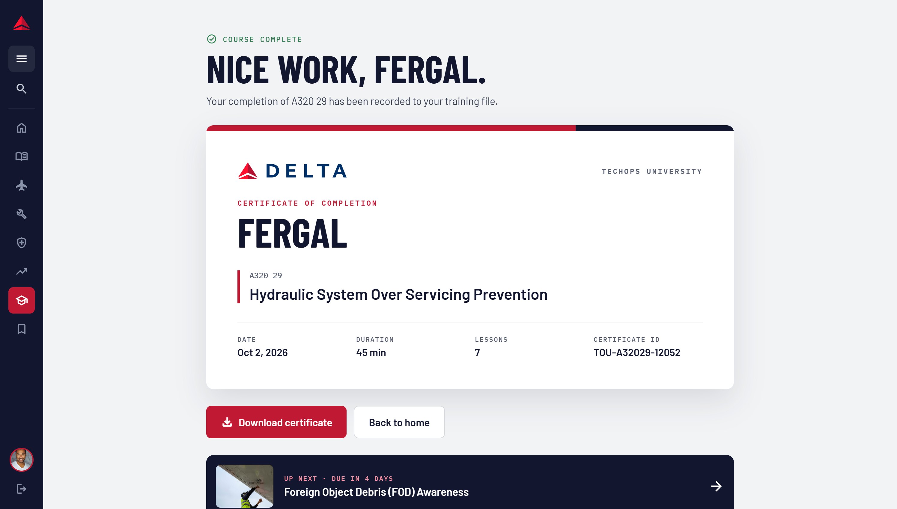
Finishing a course produces a certificate with the course code, date, duration and lesson count, recorded to the technician’s training file.
The test was simple: could a technician with ten minutes between jobs open the site and be back in their lesson in one tap?
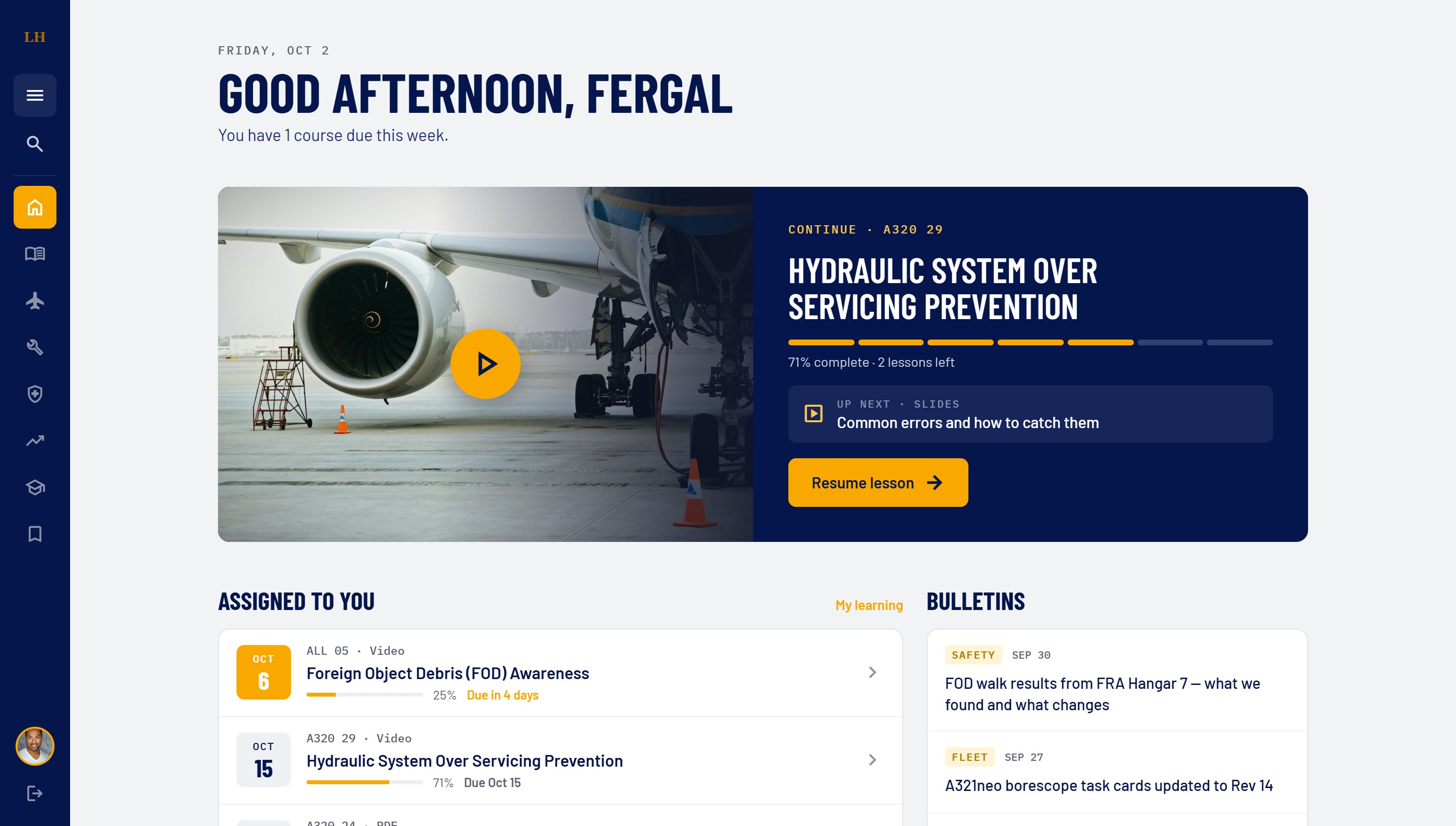
ReflectionDelta owns the portal, and the plan is to license it to other carriers' maintenance organisations. Brand lives in a small set of tokens: logo, two core colours and an accent. Swapping them re-skins the whole product without touching layouts, components or content structure. Here is the same home screen as a Lufthansa deployment.
01
Primary, surface and accent colours plus the logo are the only brand inputs. Everything else derives from them.
02
Accent-on-text pairs are checked per brand, so a yellow accent gets dark button text where Delta's red uses white.
03
Courses are keyed by aircraft type and ATA chapter, which every operator shares, so a new airline can load its own library into the same structure.
Concept mock-up · not a Lufthansa product